
okana pokē bar
ART DIRECTION NAMING VISUALS PACKAGING UI COLLATERAL CLIENT MANAGEMENT
ART DIRECTION NAMING VISUALS PACKAGING UI COLLATERAL CLIENT MANAGEMENT

ROLE & SCOPE
Developed concept, name, visuals, packaging, UI and other store collateral and communication tools as a leader of the creative team at vegrande®.
CONTEXT
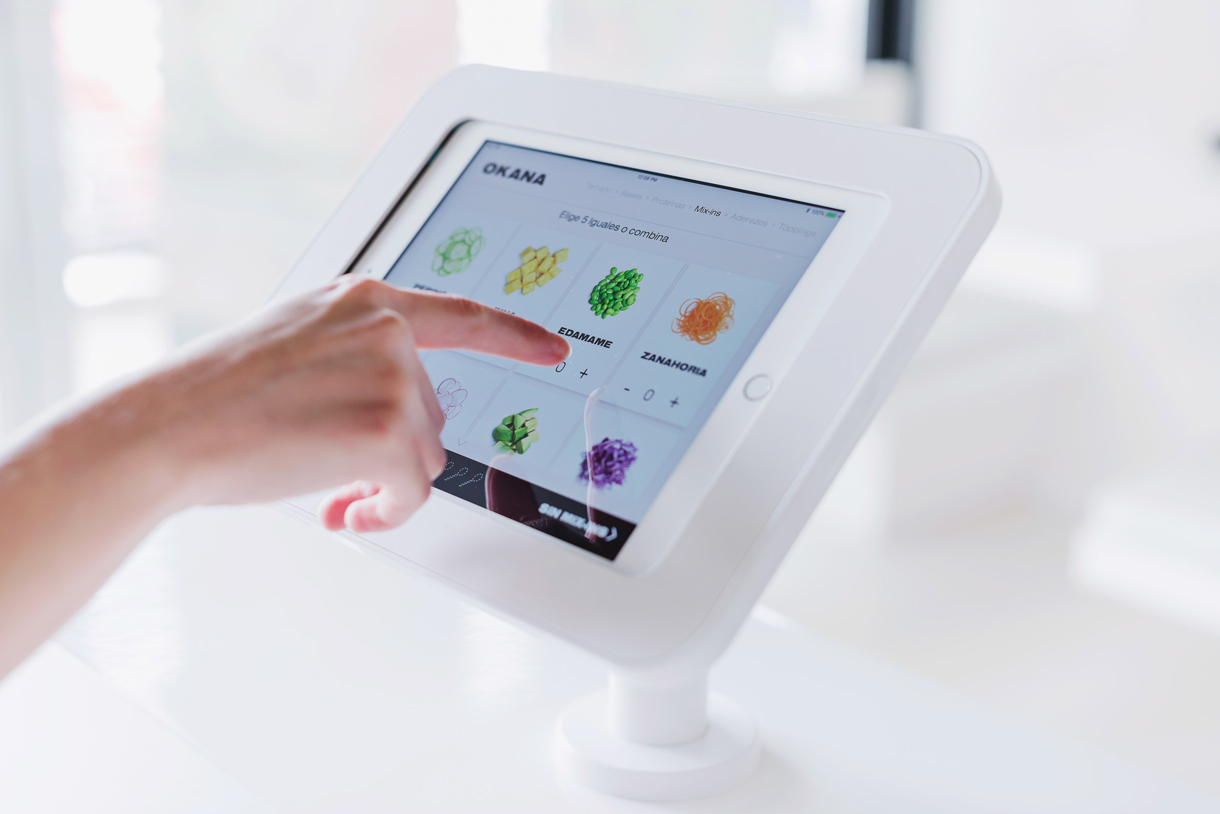
OKANA is a new take on Hawaiian-inspired quick service poké shops, which have been strongly positioned around the world for offering flavorful, complete and healthy food.
The visual identity is built out of typographic experimentation, focusing on blending and repetition; it aims to introduce the user to a full and unique experience inside a vibrant and deeply inspired urban space. We decided early on to exclude any Hawaiian visual reference, so that the colors and textures of the ingredients in every bowl were highlighted throughout the branding system and inside the shop. Only certain applications use the Hawaiian language to pay homage to the food's heritage, in a bold and atypical way.


ROLE & SCOPE
Developed concept, name, visual identity and communication tools for the third edition of the festival as a leader of the creative team at vegrande®.
CONTEXT
OKANA is a new take on Hawaiian-inspired quick service poké shops, which have been strongly positioned around the world for offering flavorful, complete and healthy food.
The visual identity is built out of typographic experimentation, focusing on blending and repetition; it aims to introduce the user to a full and unique experience inside a vibrant and deeply inspired urban space. We decided early on to exclude any Hawaiian visual reference, so that the colors and textures of the ingredients in every bowl were highlighted throughout the branding system and inside the shop. Only certain applications use the Hawaiian language to pay homage to the food's heritage, in a bold and atypical way.
